It is expected that eCommerce will continue to boom in 2022. Some expect worldwide eCommerce sales to reach $5 trillion this year. If businesses want to boost their revenue, then they will need to optimize their website and checkout experience.
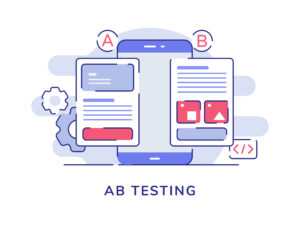
Typically, this is done through A/B testing, but what is A/B testing in eCommerce? Alongside split testing, it is used to compare two different versions of the same webpage or procedure, like the checkout process, to understand how consumer interaction changes.
Why A/B testing is necessary for eCommerce
A/B testing refers to a randomized experimentation process where different variables are shown to different users to uncover which option has the greatest impact on conversion rates. A/B testing will identify the design, content and methods that elicit the best response from visitors. You and your team can use this information to implement the most suitable updates to the website. In some cases, you may learn what actually does not impact the consumer experience. This information is crucial for businesses to stay competitive in the markets they’re selling into.
The benefits of A/B testing
When executed correctly, A/B testing eCommerce touchpoints offer numerous advantages. The following are some improvements you should see as you apply changes based on the data gathered from your tests.
Better address visitors’ needs – Whether they’re trying to learn something new or obtain a product or service from you, users always have a goal in mind when visiting your website. One of the primary objectives of split testing is to uncover the pain points users experience while in pursuit of this goal, and to do away with any inherent friction in their journey.
Increased engagement – Up to 80% of customers who churn (abandon the page) are those with little to no engagement. Your A/B trials will help you discover which changes lead to increased engagement. Higher engagement means less attrition and more opportunities to build brand loyalty with consumers.
Lower cart abandonment – The checkout experience is a pivotal moment for consumers as it is the final step in the sales process. Testing can help you pinpoint what facilitates purchase follow-through and what causes cart abandonment. Elevated levels of checkout completion will lead to more revenue and help you better monetize existing traffic, without having to invest additionally in acquisition tactics.
Reduced risks – Often, big changes come with high risk associated, like that of negatively impacting your bottom line. Instead of focusing on expensive, time-intensive changes – for example, like a full webpage redesign or introducing an entirely new feature – split testing can help you zero in on those minor, incremental changes that could result in an increased ROI. What’s more, A/B testing is also great for testing hypothesis that you want to rule out, giving merchants more certainty and confidence in their outcomes.

A/B testing ideas for checkout
As previously stated, the checkout process is a crucial part of the sales process, so it is paramount to use A/B testing for checkout optimization. The following are a few eCommerce A/B ideas to explore for checkout testing. A word of warning at the start that checkout A/B tests should be localized for region and industry verticals. If you’re selling in multiple countries, checkout preferences from one region to the next will vary greatly. The same goes for different categories of products sold by the same company, which should be tested in separate instances.
Single page vs multi-page checkout
It can be difficult to decide between single page or multi-page checkout because there are pros and cons to each. For example, single page checkouts have the advantage of reducing the number of distractions since everything exists on a single page, but they may have a longer loading period. Also, they make it harder to pinpoint the area in which users usually abandon their carts.
On the other hand, multi-page checkouts have the advantage of faster loading times, and it is easier to distinguish where users leave the checkout process. A/B testing will highlight which checkout experience facilitates the highest rates of completion. Additionally, further tweaks can be tested once you have chosen your preferred method.
Different Templates
There are many ways to format your checkout page. Your checkout page or pages may have one column of information to fill out, or you may choose to use multiple columns. Where and how key information like – cost, contact information for customer service or trust seals – is displayed should be considered as well. Consumers do not want to be surprised with hidden fees or shipping costs, so they must be able to easily locate this information.

Form Fields
Form fields may seem straightforward; however, you should try out different lengths and features. Should you include separate First and Last name fields or a Full Name field? One or two fields for address? Different fields for Billing and Shipping addresses or a “Same address” checkbox? These and many others should be tested to assess what works best for your client profile.
Without testing your form fields, cart abandonment may occur if the visitor gets confused or if they feel the process will take a long time to fill out. You should also try to implement helpful features like autofill or missing field notifications, to better guide the user to the intended result.
Call to Action (CTA)
To begin the checkout process, you must first get consumers to the checkout page. Every page in your purchase funnel should contain a call to action. Generally, these are small buttons that read “Check Out” or “Buy Now” or “Place Order” that advance the customer through the checkout flow.
Regardless of what the CTA is, be sure to also investigate how different fonts, colors, sizes, and locations impact checkout performance.
Trust Badges/Seals, Guarantees, & Refunds
Consumers may be hesitant to follow through with a purchase. Badges, guarantees, and refund policies can put the patron at ease. Unfortunately, they can be easily ignored or missed, which is why an A/B test on your checkout page can be used to determine the best placement for users to see this information.
By including reassuring trust seals, such as “30-day money back guaranteed”, “Antivirus protected/Secure checkout” or card scheme (Visa, Mastercard) logos, and testing their placement so that they’re visible but not intrusive in the cart, businesses can remove hesitation from users and bring them one step closer to converting.

Good practices for A/B testing
Even if your business is currently converting users to a satisfactory degree, there may still be areas on your website that are running at a suboptimal level. Luckily, A/B testing is the right tactic that will highlight the high and low areas of performance. When you do run tests, it is vital to follow a few guidelines so that your experiments are effective. Plus, the data you gain will better reflect the results of your tests.
Track your changes and attach proper KPIs to your experiments
It may seem obvious, but it is crucial to keep track of your changes. This way, when you do make changes to your site, you can implement the ones that made the most impact. Additionally, you can rerun tests that you have previously completed to see if consumer trends have changed.
Furthermore, you will need to attach the proper key point indicators (KPIs). KPIs are measurable criteria used to track performance and goal progress. There are many ways to implement KPIs; however, some broad categories to include are engagement, success rates of leads and checkout completion.
Test the invisible elements or small stuff too
Some things may seem insignificant because of their size or because they are invisible to the consumer, but they can have a big impact on how the page reads. In addition, users have expectations for how a webpage will function or where information will be placed. Explore different placement choices, word choices, and function options (like hashtags or breadcrumbs) to figure out which changes are noteworthy.
Test to different audiences
Every group will have their unique response to a test. The larger your consumer base, the more tests you will need to run. Also, you will need a fair sample size for each test. Multiple trials of the same test will help you understand how your customer base responds to a change. As well, you will pinpoint conflicting areas, so you may have to run more tests to find a solution that positively engages multiple parties.

Give the test enough time to run
You may be tempted to terminate a test if you see a significant difference right away; however, you should continue the test until you reach its preset termination date. There are many variables, like when payday lands, which can skew data taken from a brief period. For this reason, tests should be run for at least two to three weeks.
Conclusion
Every audience is unique and their preferences will change over time. Experimentation is an unending process that can be used to help you understand your audience and their preferences, which in turn will lead to checkout optimization. In addition to A/B tests, there are other more complex types of CRO experiments you can consider for your website and checkout, such as Multivariate testing (MVT), where combinations of variables are simultaneously tested, split testing and personalization. These, however, require more effort and resources, and they are greatly dependent on having enormous amounts of traffic on your website and carts.
To reap the full benefits of A/B testing, trials must be repeated, run for a long enough period, and performance measurements must be clearly defined and easy to measure. Checkout A/B testing in 2022 will be made easy when working with a professional eCommerce partner, who is well versed in conversion rate optimization. 2Checkout has packed hundreds of checkout best practices into out-of-the-box features and templates, localized for the many markets that you can sell to, and our dedicated CRO team can support you with testing different hypothesis through A/B tests. See examples of the positive CR results some of our clients have achieved through experimentation with us in this on-demand session and sign up for a free account today to test the platform yourself.
