As a consultant, you want your website to reflect the professionalism and expertise of your business. But finding the right website designs for consultants isn’t as easy as you might think – because there aren’t a lot of good examples.
In this blog post, I will outline some of the best website designs for consultants, based on my own experience and research. I hope this information helps you make the right decision for
What should be on a consulting website
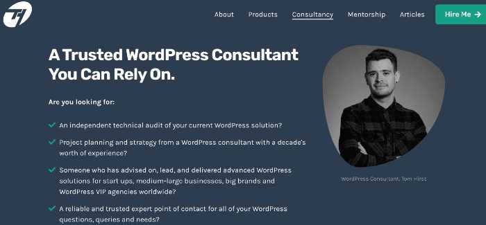
A consultants’ website should be focused on a specific audience and the problem it solves. Here are all the things that should be on a consulting website.
- 3-5 word benefit or outcome headline

- Your picture or a video that clearly outlines the specific problem in the niche and your philosophy on how the problem is solved.
- A navigation bar across the top: About, Products or Services, Pricing, Schedule, Articles, Contact
What to look for in website designs for consultants
When looking for a website design theme for your consulting business, there are a few things to keep in mind.
- Mobile friendly: In today’s world, it is essential that your website is mobile friendly. More and more people are using their phones and tablets to browse the internet, so you want to make sure your site looks great on all devices.
- Ease for you to use: You don’t want to spend hours trying to figure out how to set up the site and make any changes
- Fast: A fast website is essential for a good user experience. No one wants to wait around for a slow website to load, so make sure the theme you choose is optimized for speed.
- SEO friendly: A good website theme will be SEO friendly, meaning it will be easy for search engines to find and rank your site. Some of the things to look for include clean code, proper tag hierarchy, and schema markup.
- Clean, professional design: The design of your website should be clean and professional. Look for lots of white space, mostly static images, nothing flashy.
- Feature your image prominently: As a consultant, people want to see who they will be working with. Make sure your image is prominently featured on the site so potential clients can get to know you. You can even have a video feature where you do a quick presentation or talk.
What’s the best website platform for consultants?
Every marketing person will tell you to choose a WordPress Theme. WordPress is a great choice because there is a free option with lots of professionally designed templates.
If you want more customization, you can find affordable WordPress help on UpWork.
If you intend to post articles, blogs, and videos –choose WordPress.
But if you only want a basic website with a list of services, you have other options
Hosted Website Services
Wix, Squarespace, and GoDaddy are just a few easy, hosted options where you can get a website up in a few minutes (assuming you have all your image and content ready to go.
Landing Page Software
A lot of people think of landing pages as an add on to their existing sites. But you can run an entire business with just a few landing pages.
LeadPages: Is a terrific option because they have dozens of professionally designed landing pages that you can use to capture leads and your services — without a full website.
Unbounce: This is another popular landing page builder that you can use.
Kartra: This is actually an entire business in a box – where you can create landing pages, lead capture forms, and an email marketing system. This, however, doesn’t have a blog feature.
Best Consulting Website Designs Reviewed
In this section, I thought it would be fun to share and review some of the designs I’ve seen out there and what makes them great.
SquareSpace Website Example

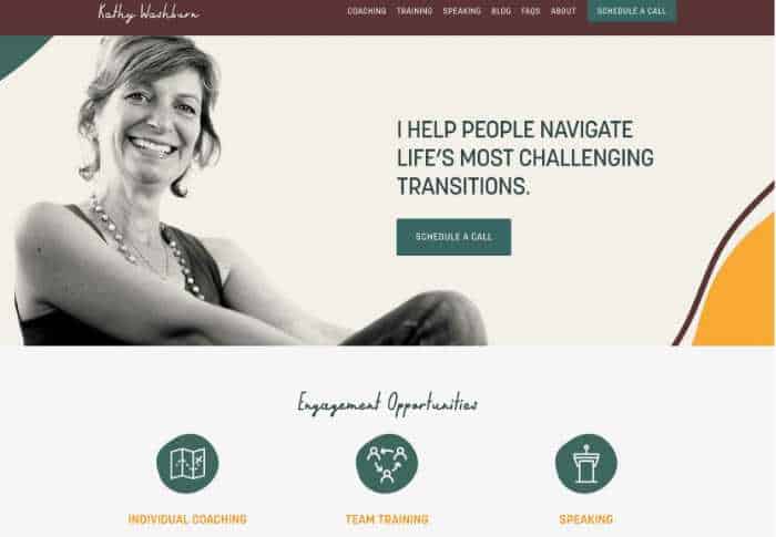
There is so much to love about Kathy Washburn’s old site.
- Awesome picture that tells you a lot about her
- Call to action buttons EVERYWHERE on every section of the page and on top.
- What to hire her for– right below the picture.
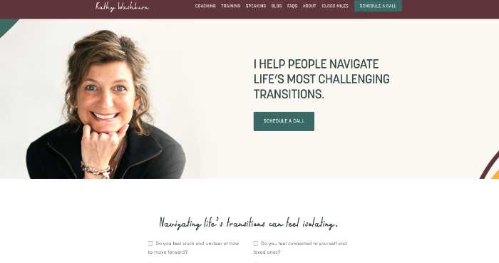
The new and updated site isn’t as good.

Her picture is still great — but it’s way more generic than the old one. It doesn’t tell me as much because it doesn’t show as much of her and there’s no “action”
Instead of the 3 big sections where she outlines what she does, she’s asking questions. I tried to click on those – but nothing happened. e
Overall, a good design, but I think the older version is better
Her site is by “Knapsack” a design agency that specializes in Squarespace websites.

WordPress Elementor Example

Let’s look at Ash Wealth:
This site tells you upfront what they do. I love the large picture of the family and the other important feature here is the “As featured on” social proof bar underneath the picture.
So the picture gives you the “know and like” while the social proof bar gives you the “trust” factor.
The call to action buttons here are a little confusing. They both go to a free ebook at the bottom of the page, but the buttons say two different things; “Find out how” and “get free book”
This is a WordPress website using the Elementor Plugin. Elementor is a drag and drop plugin that is super easy to use (you don’t need an ounce of tech skills) but it does require some patience. However, Elementor is very popular and you can find thousands of WordPress folks with Elementor experience.
Treat Your Website Like a Direct Marketing Piece
Overall most consultant are missing out on a tremendous lead generation opportunity from their websites. Too often the site is focused on the consultant and NOT on the problem that they are solving.
Your site should be focused on helping the visitor see that you understand their problem and then get them to take action by either subscribing to your email list or picking up the phone to call you.
Use these tips to turn your consulting website into a lead generator.