The definition of an effective and excellent user interface design (UI) is pretty subjective. UIUX Designer’s often looking to improve their ability and creativity in design. What is UI design and why do we need to have a great UI design?
The main purpose of user interface design is to make things as effortless and enjoyable as possible for the user. Wen design UI defines as the visual layout for all web design elements. A mobile app user interface, or mobile UI, is the display or screen on a mobile device and the performance of the app in it.
This article will give you the best tips for good UI design. With some effort, you can improve your designs, hopefully giving you some handy pointers for when you’re starting your next project.
What is User Interface design? Why is it important?
A user interface defines the user interaction with the product. User interface design, therefore, is the act of designing the thing that the user interacts with, whether that’s the shapes on a computer screen, the buttons on a remote control, or a hardware/software combination.
UI design is often placed into its own, separate category of UIUX design apart from the user experience (UX design) because of its tendency to focus on the visuals of a product. However, UI design is a significant part of larger UX design practices.
Best tips for having a better UI design
1- Improve users’ onboarding experience
Allow users to skip the Mobile App Onboarding process at any time. The Skip link is within easy reach.
2- Know audience you are designing for
Responsibility of a UX designer mostly defined in tasks like user research, wireframing, testing and information architecture design. But we’ve increasingly seen a blend of the UIUX designer role emerging. UX designer job postings request UI skills. Also, UI designers should get involved or at least have a base understanding of these UX skills.
3- Improve contrast between text and images
Depending on where the text may be positioned over your image, you can either optimize it for a tried and tested full image overlay, or a more subtle gradient overlay to achieve a simple contrast between the two elements. It’s one of the best useful UI design tips.
4- Element Placement and Size
The UI design is all about clicks, taps, and scrolls on devices. You need to ensure that every time a user clicks on your website, it’s the click that turns into a conversion. Pay attention to your site’s element placement and size to make that happen. As a good web design, keep the size appropriate and placement spacious enough to get a real hang of the whole thing. Avoid click-mistakes. Make sure to make the buttons that are most frequently used – submit, start, send – more prominent and larger than others.
5- Use dark text with light backgrounds
When working with a light background, don’t make your text too dark. It may look as if everyone else is doing it! You can create fantastic UI designs easier, and faster with Design System’s in design applications.
6- Break choices down
Another UI tip is to break your choices down. Limiting and grouping choices can be less complex by dividing them step-by-step in design process. If we’re presenting many configuration options, the interface should do the heavy lifting rather than the user.
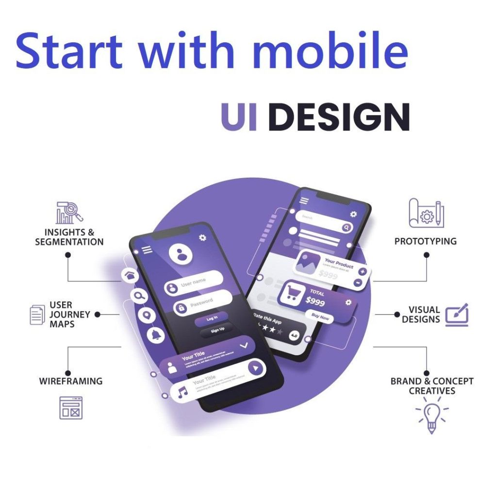
7- Start with mobile
Up to 70 percent of website traffic comes from mobile phones nowadays, it’s vital to have suitable digital interface element’s that are optimized for mobile users. The desktop view has often been the canvas of choice for a UI designer. Designing the mobile app view as an alternative first forces us to strip out all of the unnecessary noises and focus on the essential element’s that are crucial for users needs to perform the tasks within the interface.
8-Use a design system
When multiple designers are involved in a UX UI design, it often ends up with countless variations of the same UI components. It can help create a design system of reusable components with clear standards, and then they can be assembled to build the different applications needed. A good example is IBM’s Carbon Design System. Carbon Design System is a comprehensive set of visual, code, and user experience guidelines and standards that are used to create the IBM Cloud platform and more than 120 services.
9- Use Centred Text in moderation
Remember to keep it on the low and use Centered Text only for Headlines and small passages of text. For pretty much everything else keep that left aligned.
10- Clean up your design
Cleaning up and organizing files and project folders is an essential part of your project. Most of the projects are becoming long-term, so this is a necessary segment for us. Keep your folders clean and tidy. To avoid clutter, old and outdated documents should be archived (filed in an Archive subfolder).
If you need a Ui and ux design agency contact Temismarketing now.


