

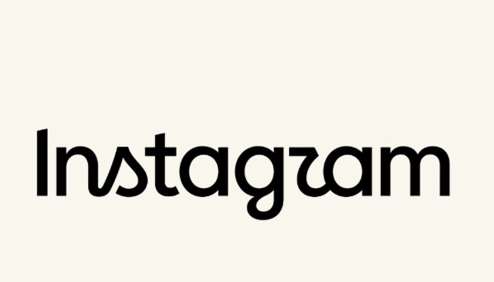
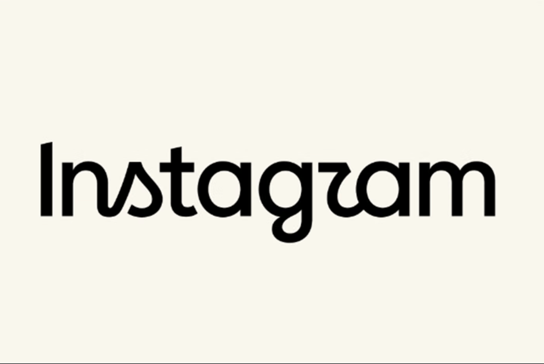
You’re not imagining things; after roughly ten years, Instagram changed its logo, and unfortunately for the Meta-owned social media platform, no one is rocking with it.
Instagram retired its iconic cursive wordmark and replaced it with a new design that features both cursive and structured printed lettering.
The new logo, which now lives on the top of your IG stories timeline, also features a different look for “s,” “r,” and “g” in the new logo. It’s the only big change; everything else, like the multicolored gradient camera icon, remains the same in the app.
According to Hypebeast, the logo change “serves as the foundation for a broader brand identity shift unfolding across Meta’s digital ecosystem.”
The website reports that Meta claims they landed on the updated logo after considering 100s of potential designs.
Per Hypebeast:
Jasmine Probst, Instagram’s director of product design, noted that the chosen script reflects individuality while injecting bolder, simpler elements with unexpected touches. To support the overhaul, the brand is introducing three custom typeface families: Instagram Sans, Instagram Pen and Instagram Mono. The signature gradient will also transition to a more restrained application across the user interface as the full design system rolls out globally through 2026.
Unfortunately for Instagram, the new logo isn’t the hit with users they hoped it would be. In fact, it is getting clowned, with many people saying it looks like “Instagazm” and not Instagram.
They say change is good, but in this case, not so much. You can see more reactions below.
